
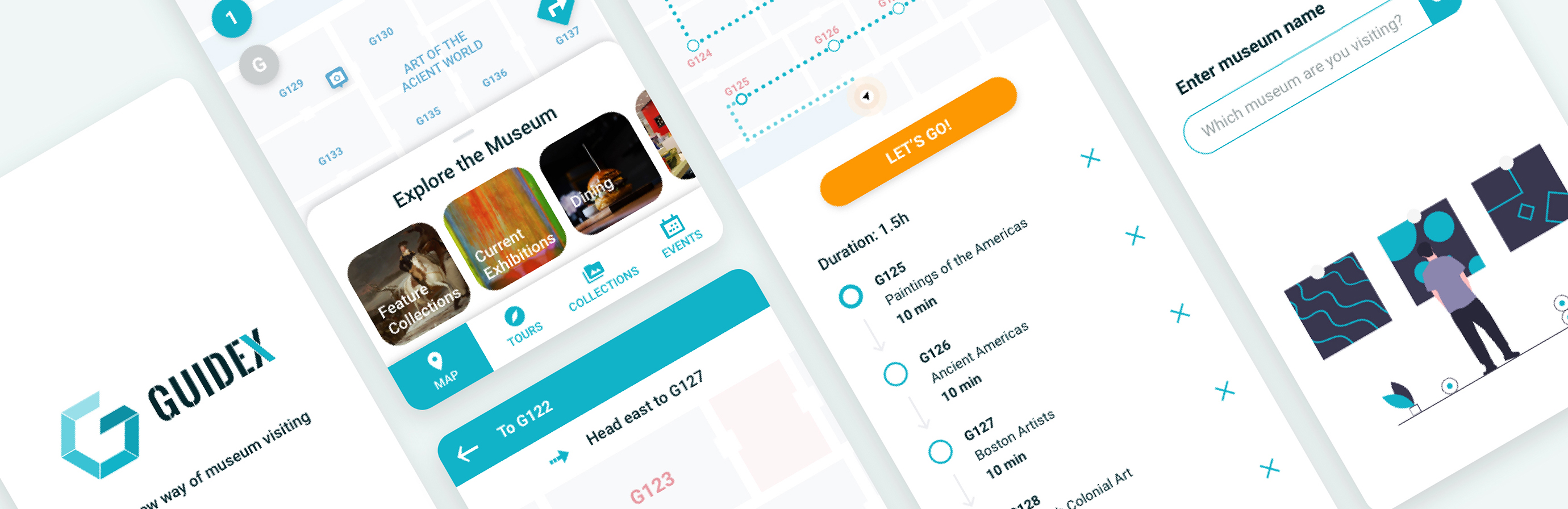
Platform Mobile App Type Capston Project Period 4 Weeks | Guidex: A New Museum Navigation Experience Museum visiting is a fun and cultivating activity, but navigating inside the museum is not always easy. Guidex provides a comprehensive navigation experience to museum visitors by offering 2 main features - interactive museum map and audio guided tours. |
MY ROLE
As the sole designer in this project, I conducted user research on people who had visited the biggest museum in my current city -- the Museum of Fine Arts, Boston (MFA).
Following the interview results, users were categorized based on 2 types and 3 behaviors, where empathy maps, personas, and users flows were built accordingly. Taken the insights from user research, wireframes and prototypes were created to solve users' problems. Simultaneously, 3 usability testings were conducted to improve user experience and user interface.
THE CHALLENGE
We all love visiting museums, no matter when we are visiting a new city, or when we want to spend a relaxing Sunday with our family. However, navigating inside a museum is not always easy. Very often people have no choice but to use paper maps and wall signs (to find a restroom, for example), which feels like a really time consuming and frustrating process.
After going through the websites and the apps of the most famous museums (i.e. Louvre, British Museum, the MET, etc.), I realized that most of the museums only had a digital version of their paper map on the website, which was not enough to solve the navigation problems of the visitors.
THE SOLUTION
"It's like indoor Google Maps with automatic audio guide."
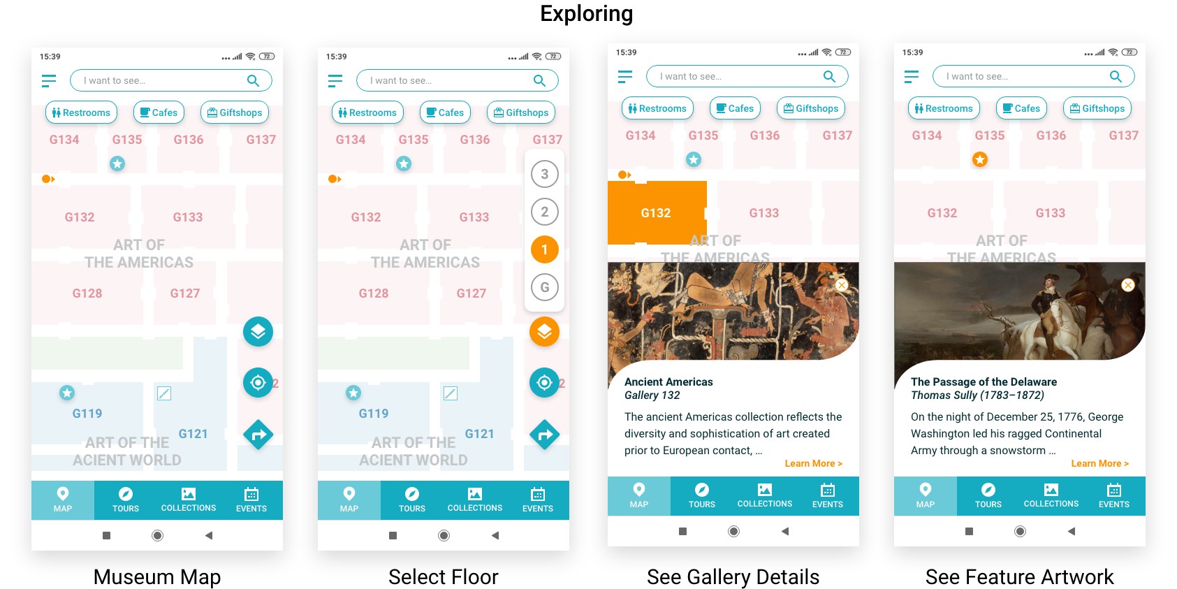
Guidex is aiming to make museum visiting more relaxing and enjoyable by solving navigation difficulties inside large museums, and using innovative guidance system with comprehensive contents to tell a better story of the museum collections.
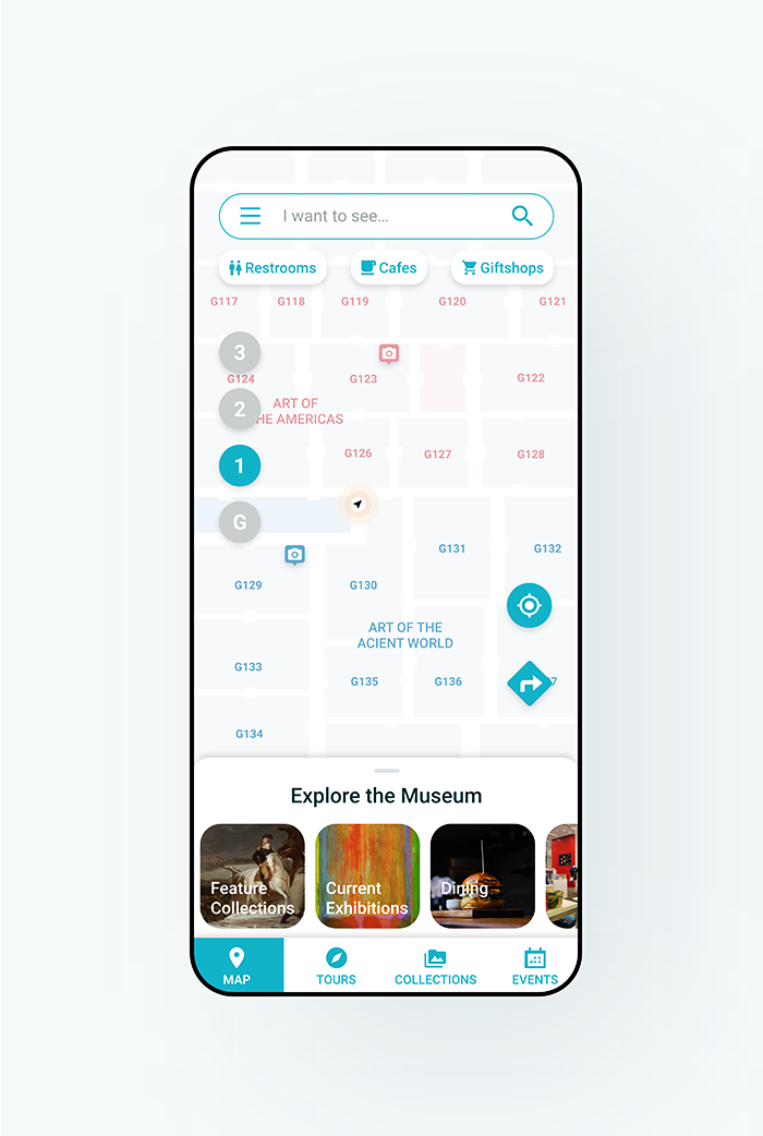
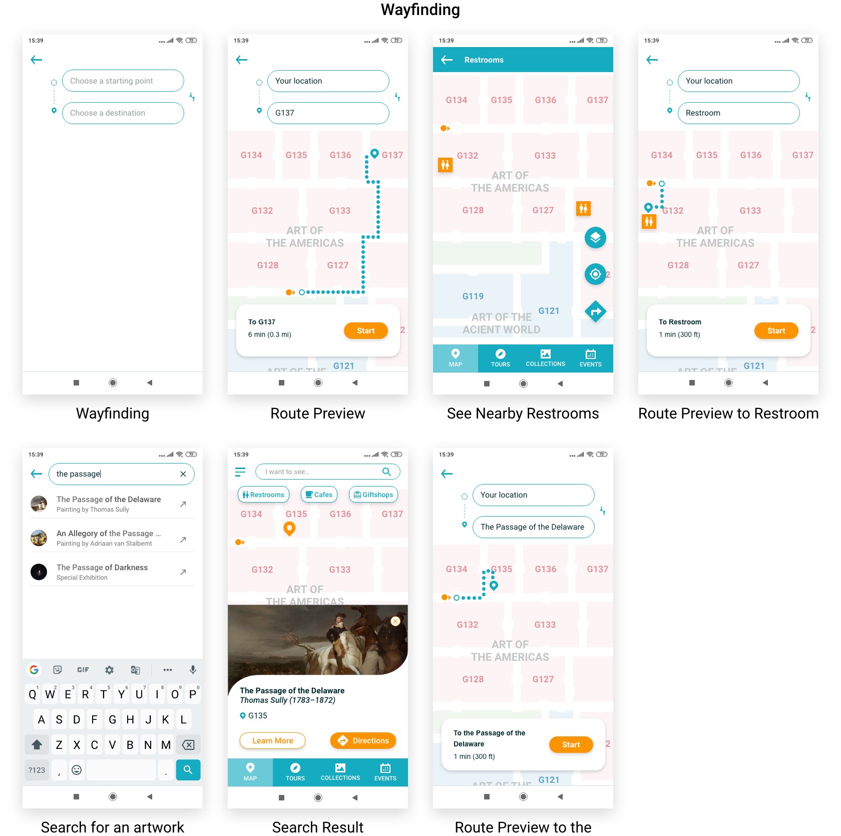
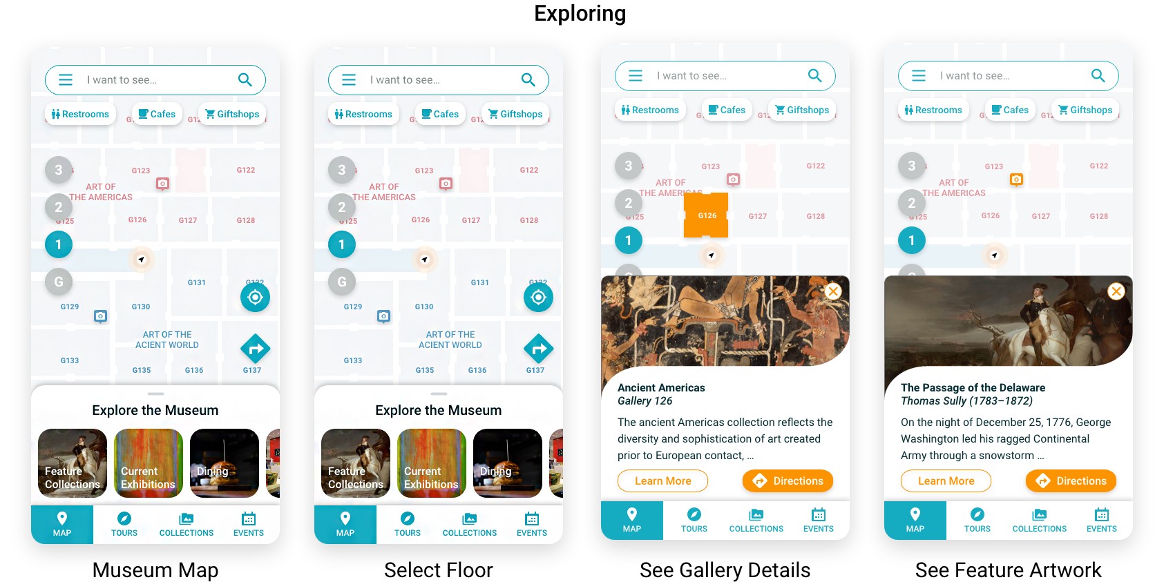
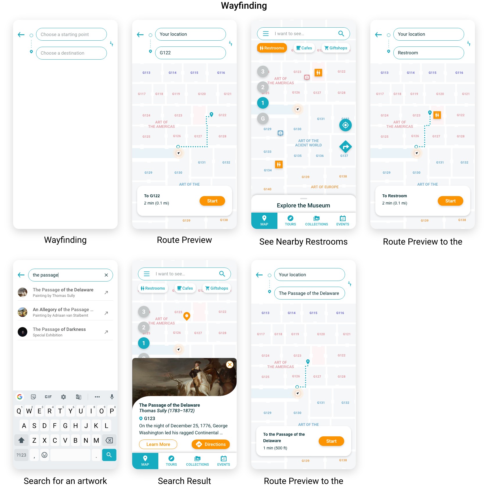
The interactive museum map allows visitors to locate themselves or navigate inside the museum using beacons. They can also conveniently check out the details of an artwork or a gallery room.
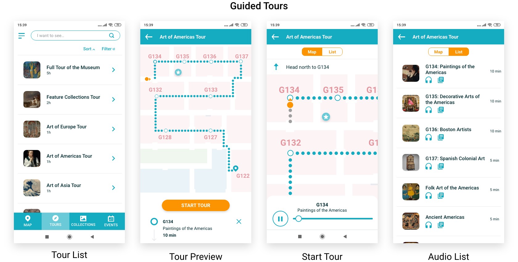
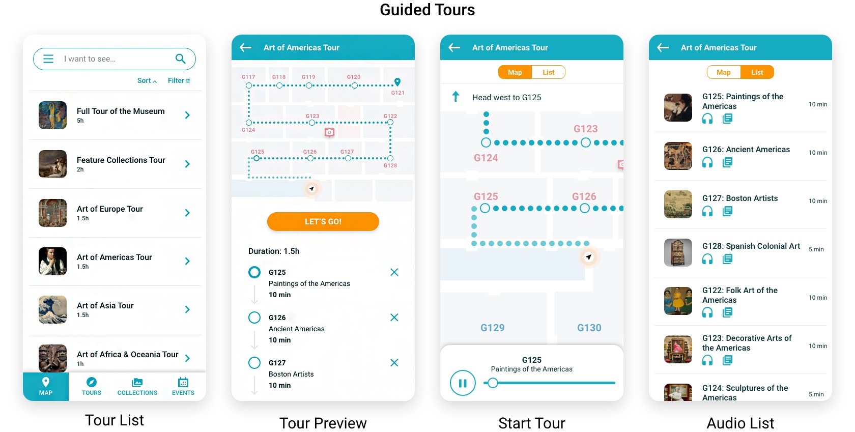
The guided tours provide various audio tours according to the visitors' preferences. The guidance system can detect visitors' location using beacons and play audio descriptions automatically.

DESIGN PROCESS
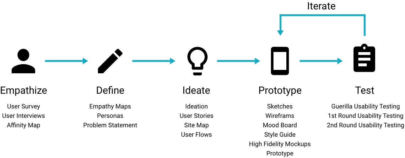
USER INTERVIEW
I conducted interviews with 6 people who had visited the MFA museum in the past 12 months, including 4 local residents and 2 international tourists. The questions were covering their last visit to the museum, and the best and worst museum experience they’ve had.
I then analyzed the interview data with an affinity map, and extracted some insights to guide me in decision-making when designing the solution.
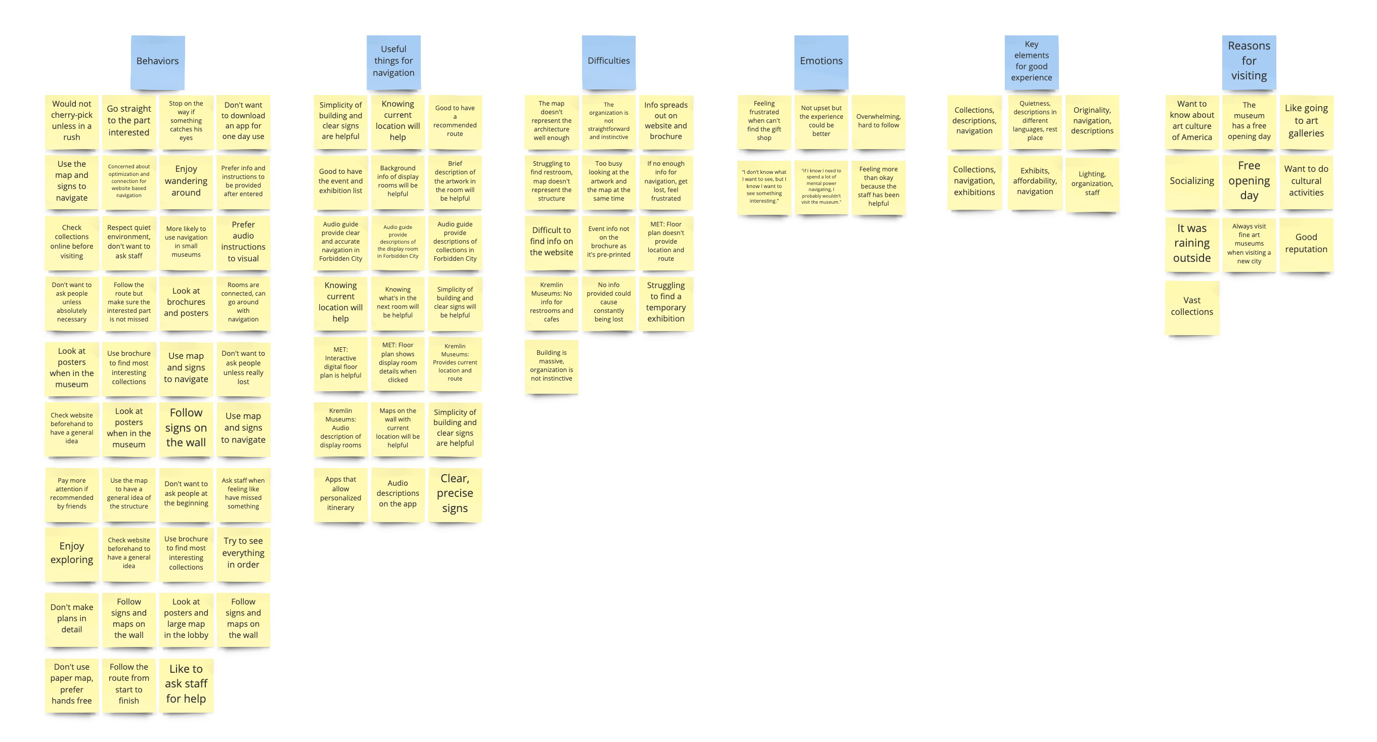
Affinity Map
100% people encountered difficulties when navigating inside a museum | 90% people followed the visiting route in the museum | 67% people found audio guide very helpful |
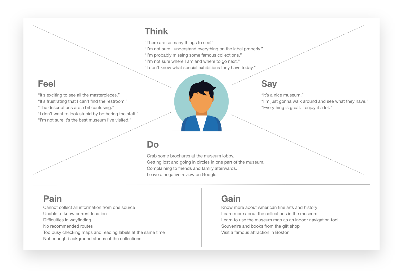
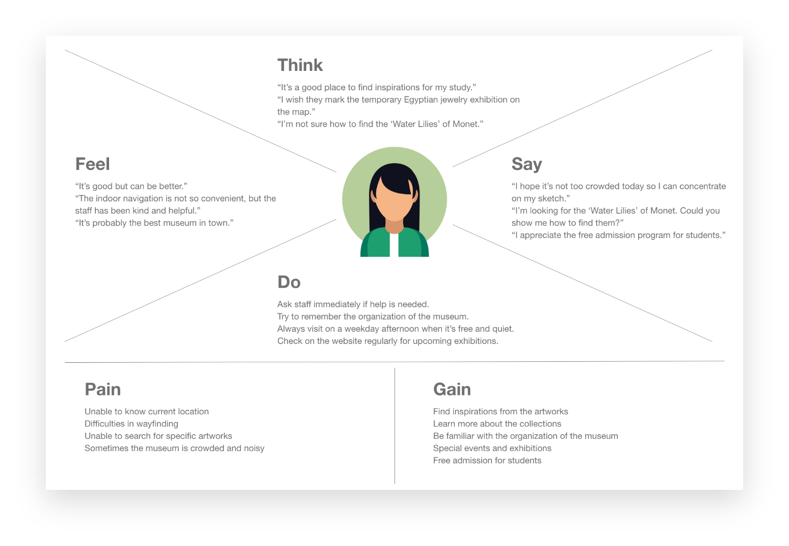
EMPATHY MAP
Two empathy maps were created according to two main visitor types - tourist and local resident - to organize the insights, observations, and quotes I collected from the interviews and to better understand visitors' pain points, goals, feelings, thoughts, and behaviors.
PERSONA
I created 2 personas to ensure that insights remain present throughout the design process.
Corresponding to the two empathy maps, I constructed two insightful personas with the findings from the empathy maps. I used these personas to remember the important details people mentioned in their interviews, and to remind myself the user groups I was designing for.
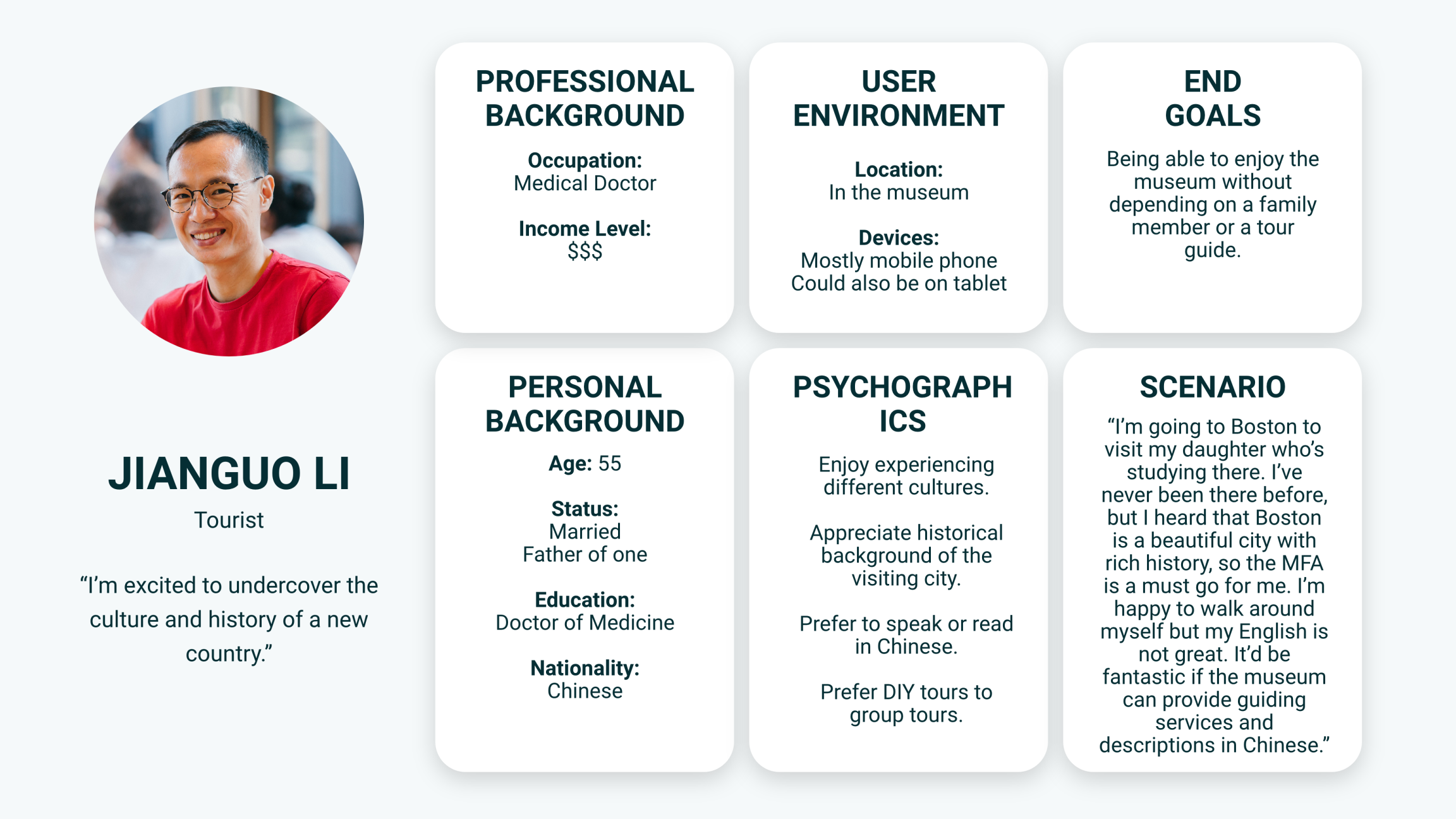
Persona of Tourist
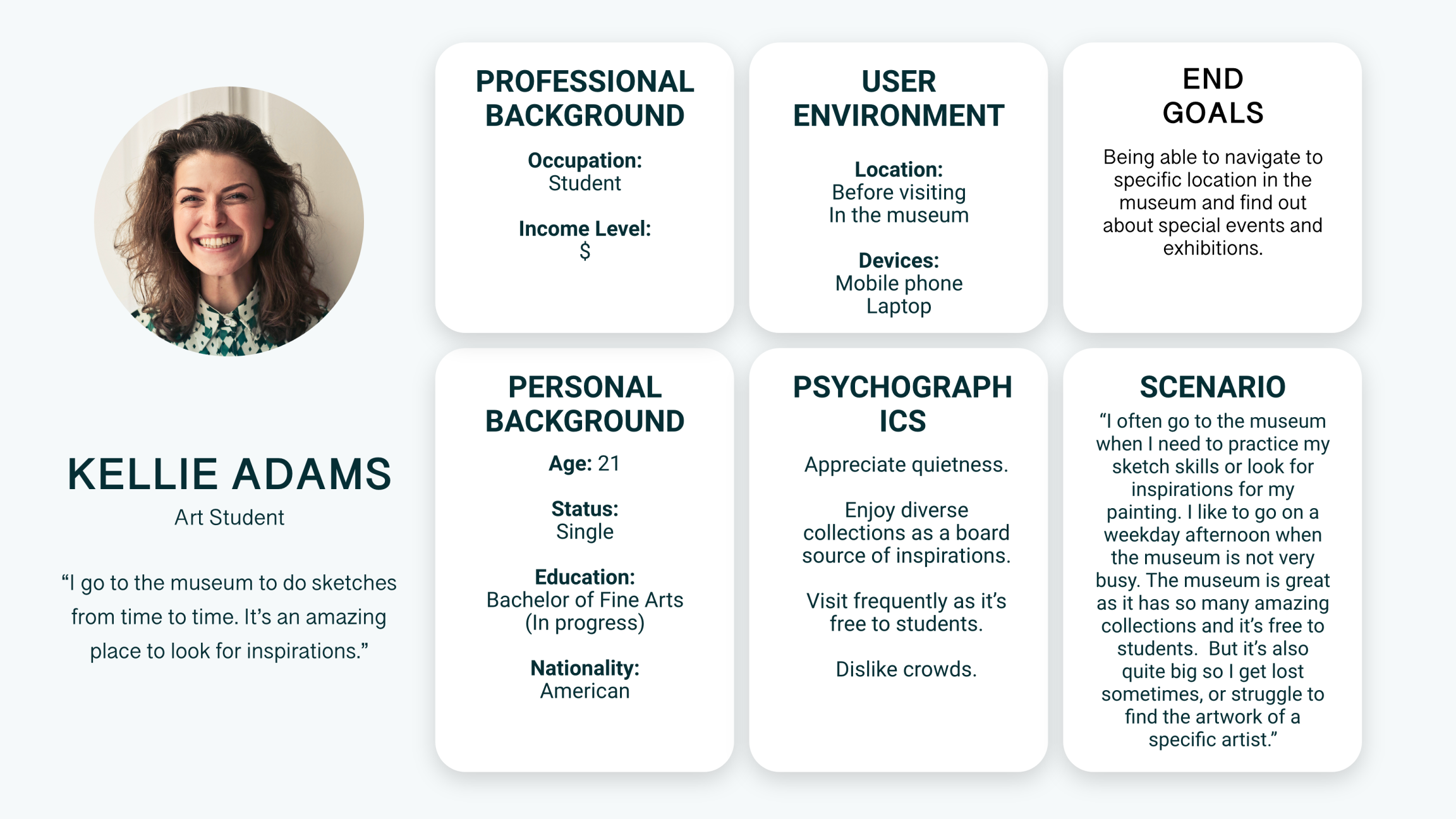
Persona of Local Resident
IDEATION
"Always refer to the findings from the user research."
In order to generate ideas for the features of the product, I looked at the pains and gains on the empathy maps from my personas’ perspectives, and used the problem statement as a breakthrough point to find potential solutions.
INFORMATION ARCHITECTURE
I drew this site map to show the hierarchy of the features and the minimum viable product (MVP). It gave me a clearer view of what should be included in the wireframe.
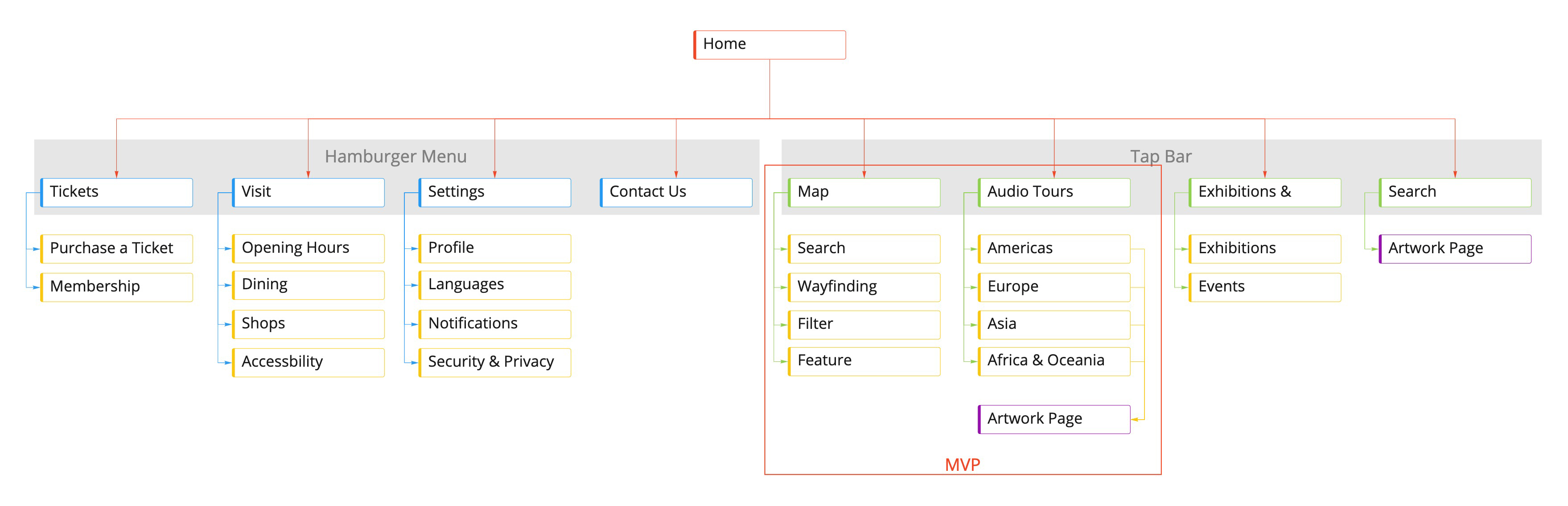
Site Map
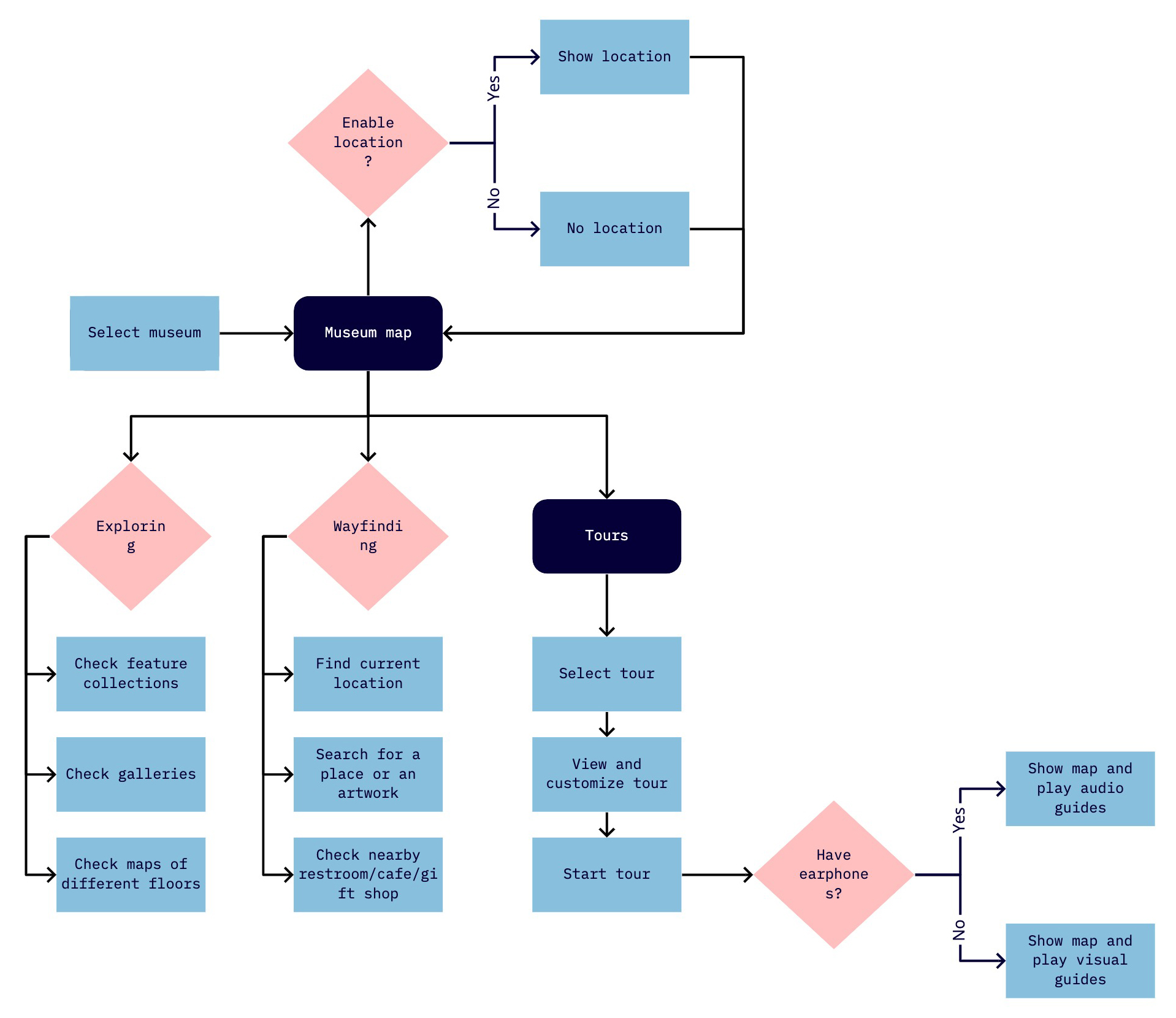
USER FLOW
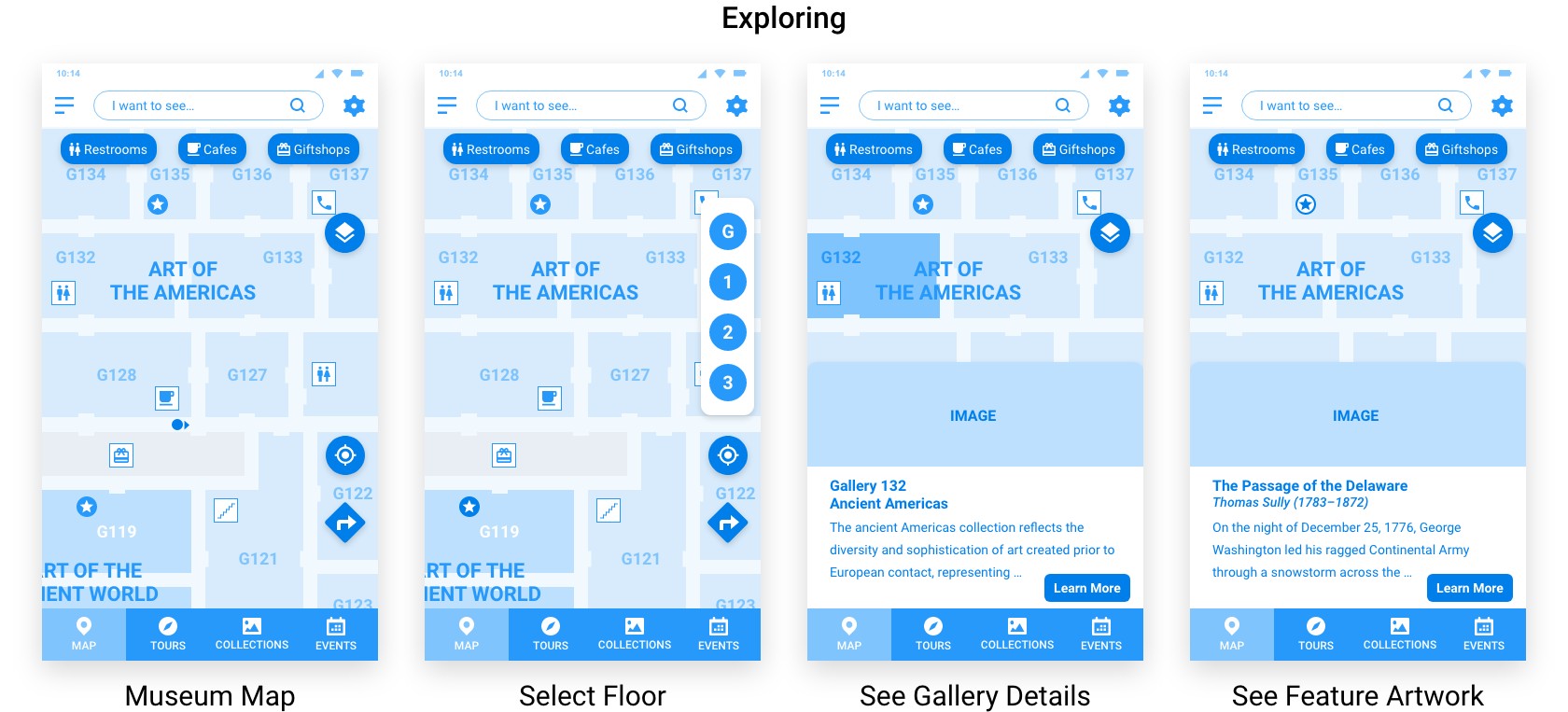
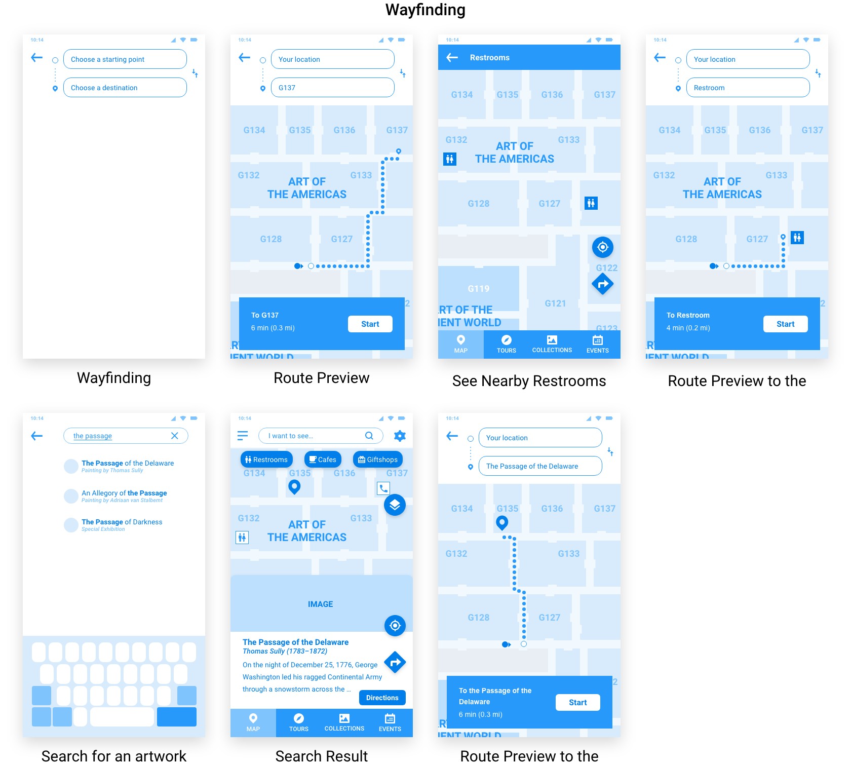
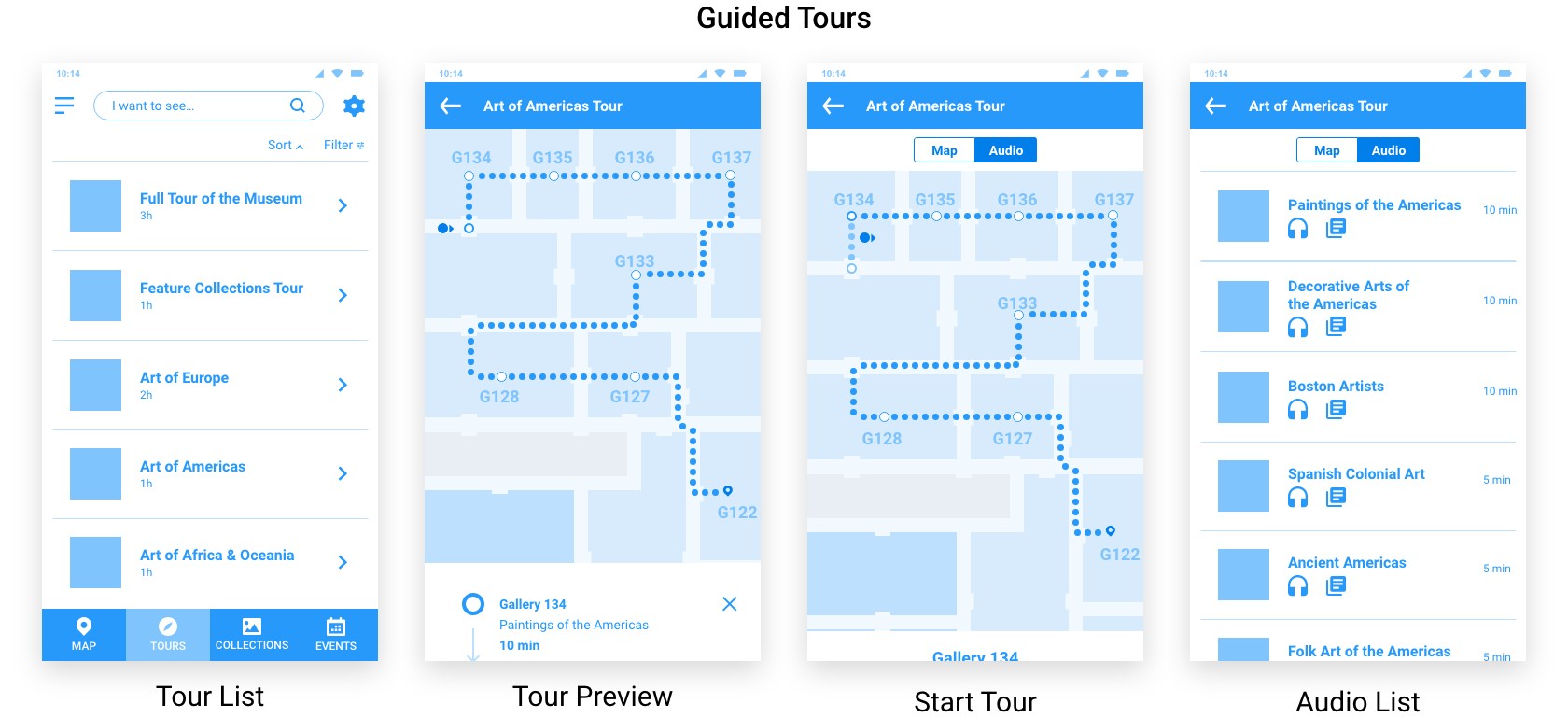
According to 3 different app usage purposes, I developed the user flow focusing on exploring, wayfinding, and touring.
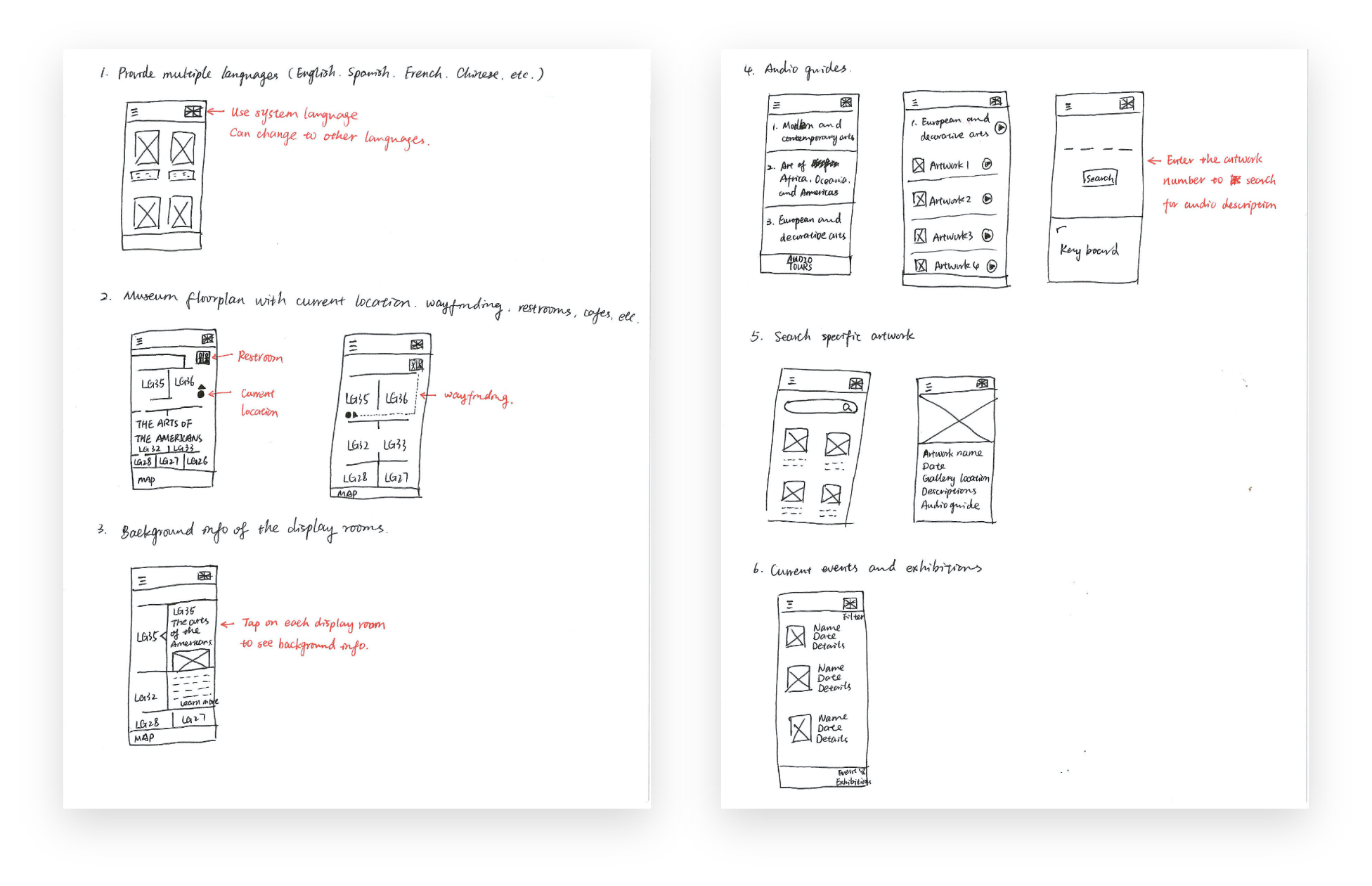
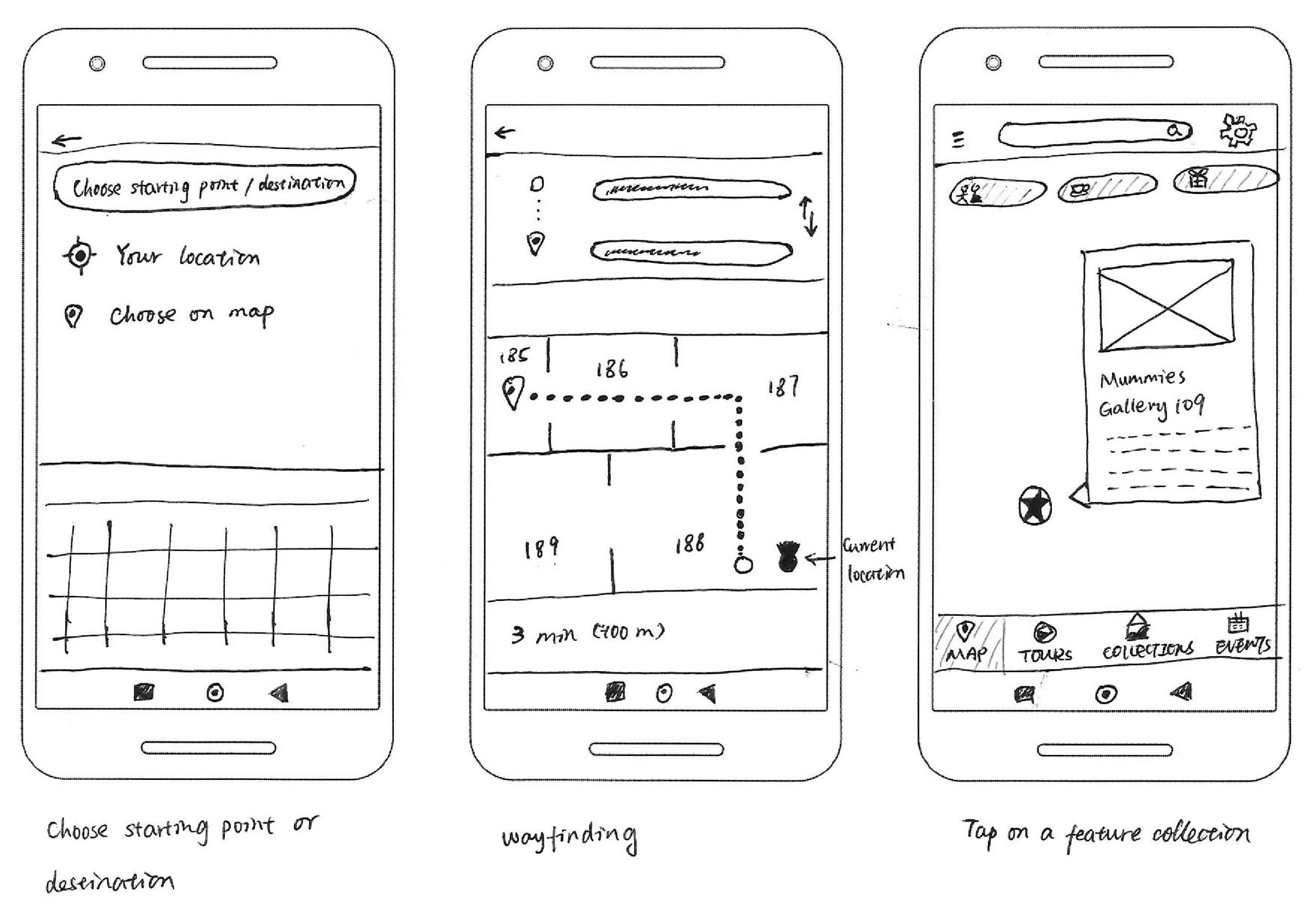
SKETCHING
I made these sketches on paper for all necessary screens of the MVP, using Google Maps as a reference to reduce the cognitive load of users.
GUERILLA USABILITY TESTING
I used the Marvel app to convert the sketches into a clickable prototype, and conducted a 15 minutes Guerilla usability testing with 3 people in a local coffee shop by offering free coffees.
Main takeaways:
| Paint Points | Solution |
1. Users don’t know what the number on the gallery means. | 1. Add a “G” (for Gallery) in front of the gallery number. |
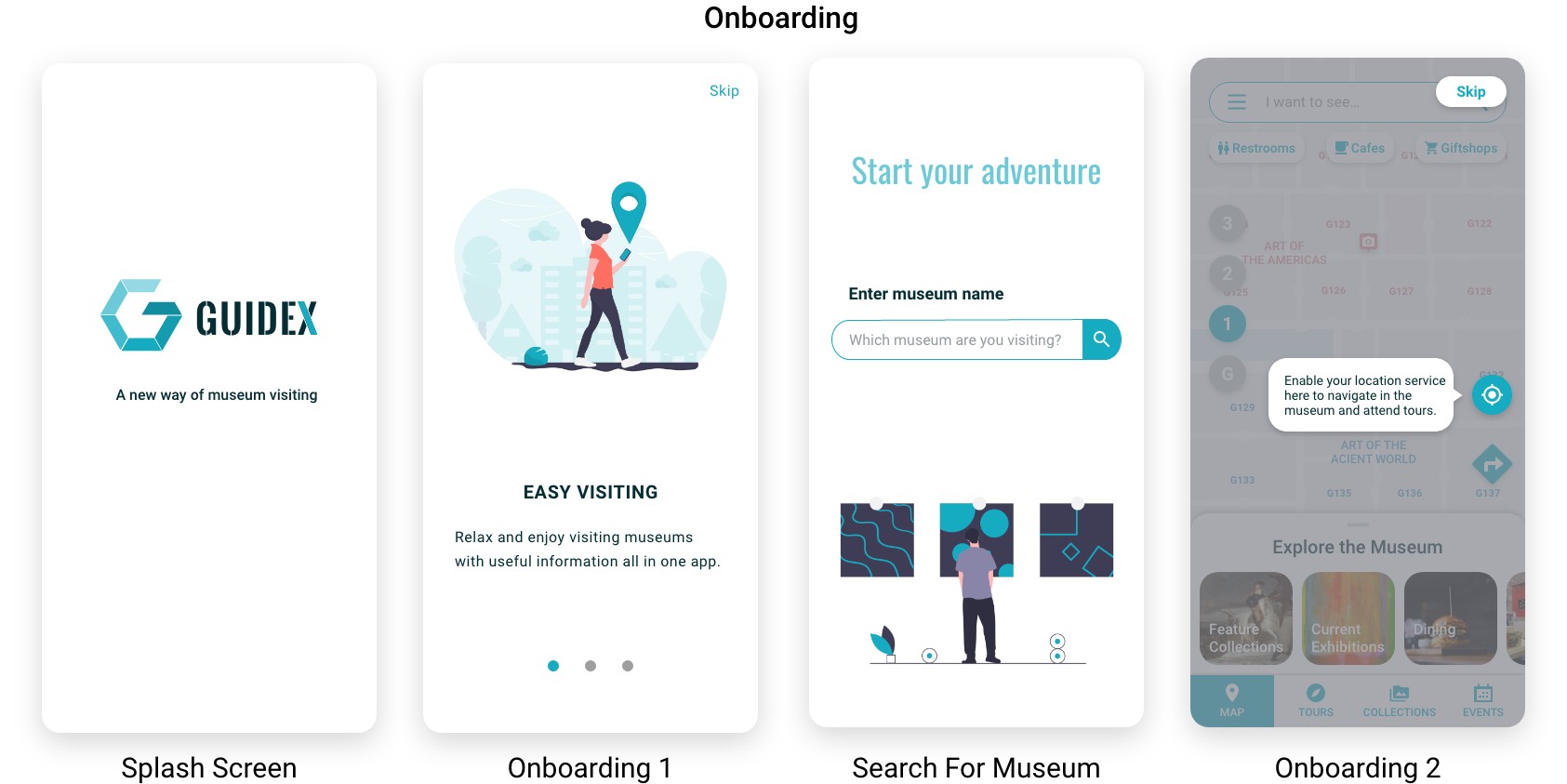
2. Users don’t know the galleries and feature artwork icons on the map are clickable. | 2. Add an onboarding section to show users how to use the map. |
3. For visitors without earphones, video tours are not so useful as they are already inside the museum. | 3. Change to audio with transcript. |
WIREFRAMING
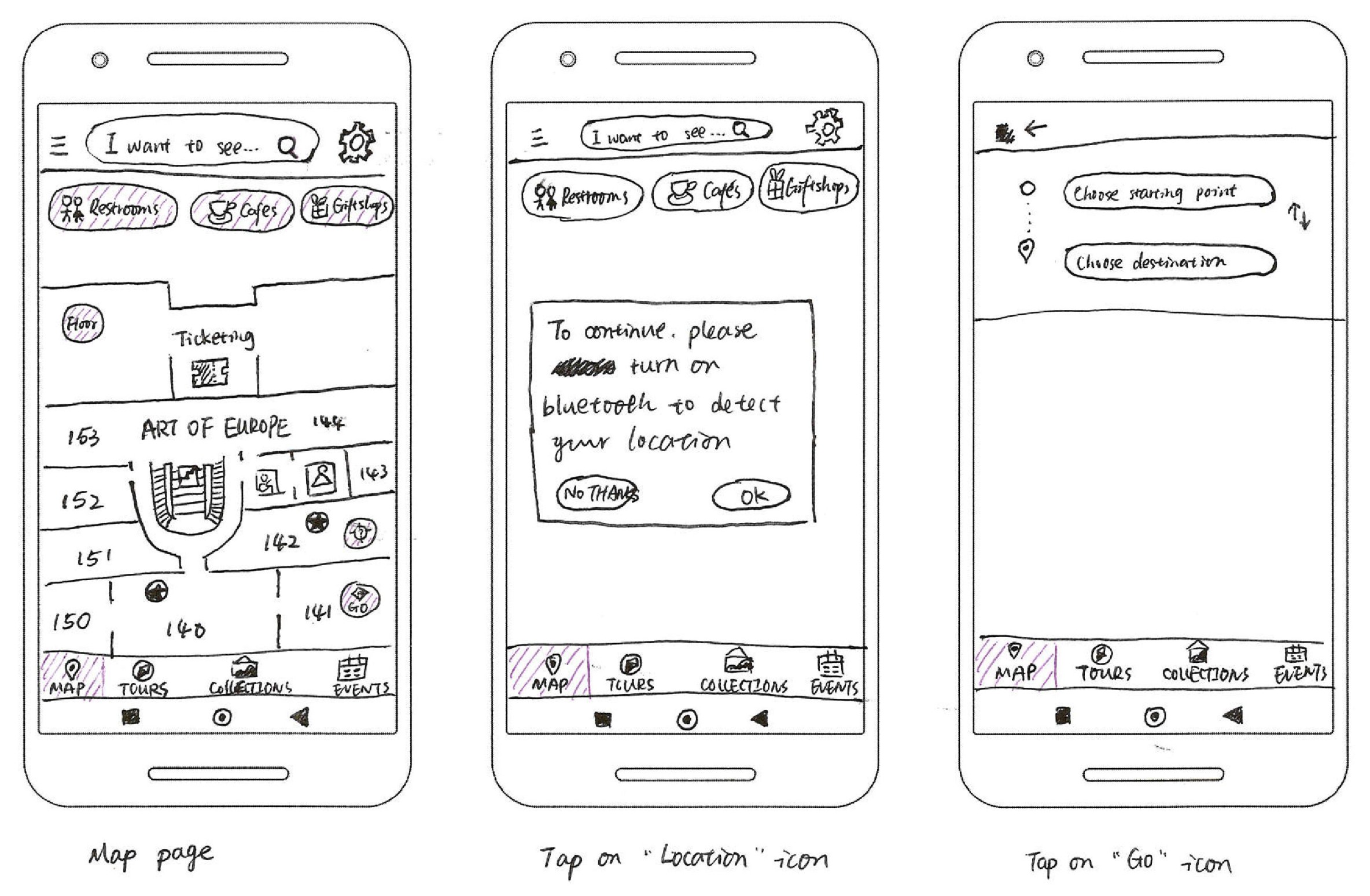
Based on the sketches and the findings from the Guerilla usability testing, I created all the key screens in this mid-fidelity wireframe.
PROTOTYPING
I wanted the app to have a clean interface to communicate a friendly, energetic, and sophisticated personality.
This personality does not only represent Guidex’s goal to make the museum visiting experience easier and more joyful, but also builds a trust between the product and the users.
To guide the design of the high fidelity mockups, I also created a mood board as well as a style guide, which defined the usage of the logo, color palette, typography, grid system, iconography, UI elements, and photography.
1ST ROUND USABILITY TESTING
To check if my solutions work well, I built a prototype and shared it with 5 people, asking them to complete 8 tasks.
I ran the usability testing by sharing the prototype with 5 people who had never seen the app before. I told them to complete 8 tasks, including finding their current location, finding their way to a specific gallery, attending a tour, etc., and observed their operation remotely online by asking them to share their screen with me.
| Pain Points | Solution |
1. Users don’t always know how to use the app for the first time. | 1. Add an onboarding section. |
2. Only one wayfinding method is available. | 2. Add a “Directions” button to the gallery detail page. |
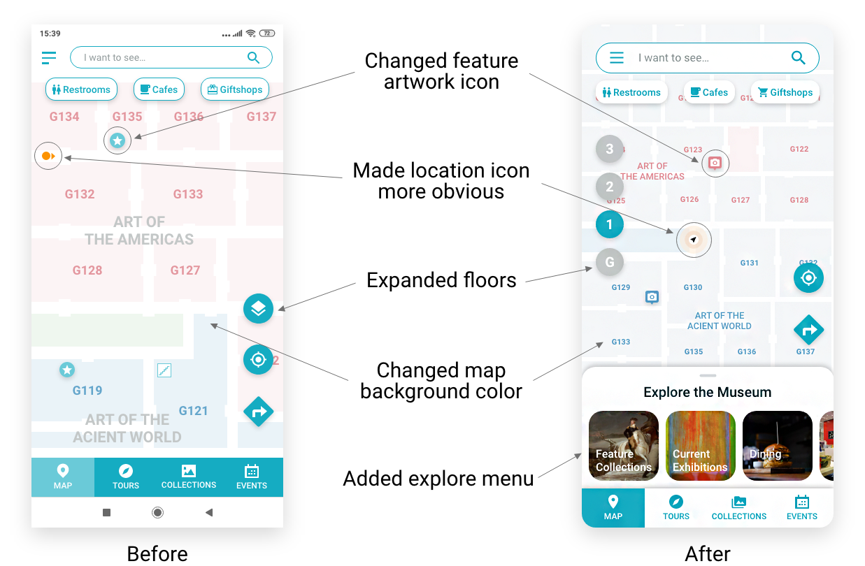
3. It's clear what the "Floors"button is for. | 3. Expand the "Floor" button, put it on the left side of the screen. |
4. Too many colors on the map, it's distracting. | 4. Change map blocks to light grey color, only use different colors on the gallery name. |
5. Users need to go back to the top of the list to start tour. | 5. Add a “Start Tour” button at the bottom of the list. |
6. Users can’t see the tour duration on the tour details page. | 6. Add time duration. |
7. The current location icon is not visible enough. | 7. Change the color and the style of the icon, and increase icon size. |
8. Users confuse the feature artwork icon with the current location icon. | 8. Change the feature artwork icon to a camera icon. |
FINAL PRODUCT
I iterated the prototype according to the 1st testing, and conducted the 2nd testing to make sure all the solutions work well and no new issues come up.

REFLECTION
Creating an end-to-end mobile app as a sole UX/UI Designer is certainly challenging. Here are a few takeaways I've learnt from working on this project:
Do your research before designing.
One of the most common mistakes made by many new designers is to believe that users think what they think, and start prototyping without conducting any user research. Before I conducted my user interviews, I did have some ideas on how to solve the problem, but I constantly reminded myself to define the problem and conduct the research, without jumping into the conclusion directly. To make sure I designed for the true user needs but not what I thought users would need, I stayed focused on the insights I pulled out from the research throughout the design process.
Do your testing early and often.
For this project I conducted 3 usability testings - the Guerrilla testing between the sketching and the wireframing, the 1st round usability testing after prototyping, and the 2nd round usability testing to check if my iteration worked. The testings were extremely effective for identifying usability issues in my prototype and to improve the user experience of the app. It also helped to discover issues that I would probably never come up by myself. Moreover, it’s important that usability testing is conducted early in the design process so that any issues can fixed with much less time and a much lower cost.
NEXT STEPS
Although the results of the usability testings confirmed that the design solutions solved the problems I originally identified, and the app has concluded with a solid prototype, further steps can still be made to improve the UI and add more features, such as multiple languages, collection library, event and exhibition list, etc.