
Platform Mobile App Type Capston Project Period 2 Weeks | Drais Bicycle: A Better Online Bike Purchasing Experience Drais Bicycle offers frictionless online bike shopping experience by helping users to choose the most suitable bike, customize it, checkout easily, and receive quality customer services that makes purchasing online even better than in store. |
MY ROLE
I redesigned this online bike store and improved its usability by enhancing its browsing and checkout experience.
As the sole designer in this project, my responsibilities covered the end-to-end design process from user research, all the way to usability testing.
My main deliverables include industrial leader research, secondary research, affinity map, user flow, sketch, style guide, prototype, and usability testing.
THE SOLUTION
"Even better than in store."
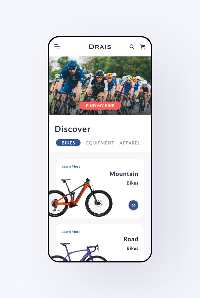
This e-commerce app of Drais Bicycle is aiming to provide a frictionless experience to online bike shopping, by helping users to choose the most suitable bike and customization, allowing easy guest checkout, and providing comprehensive services that makes purchasing online even better than in store.

DESIGN PROCESS
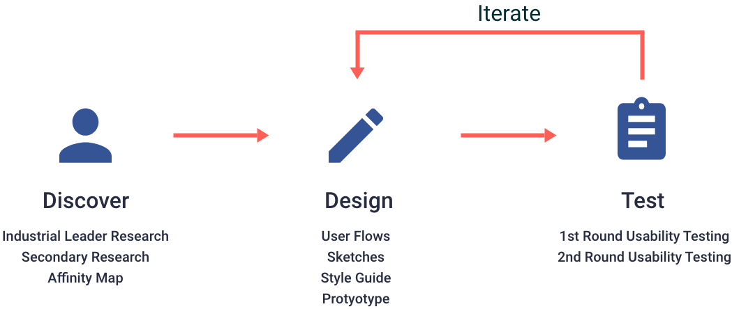
INDUSTRIAL LEADER RESEARCH
I studied 3 industrial leaders by listing the likes, dislikes and action items of each app.
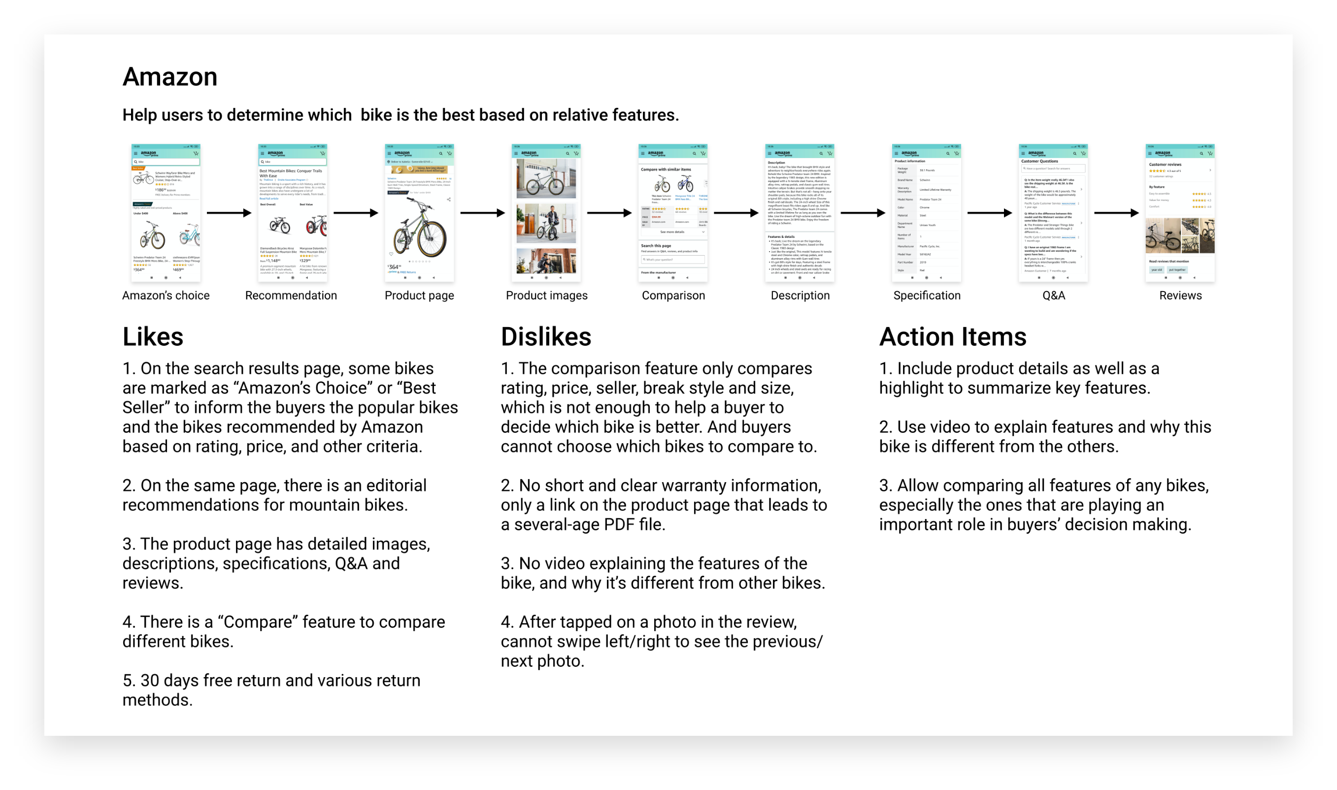
Industrial Leader Research of Amazon
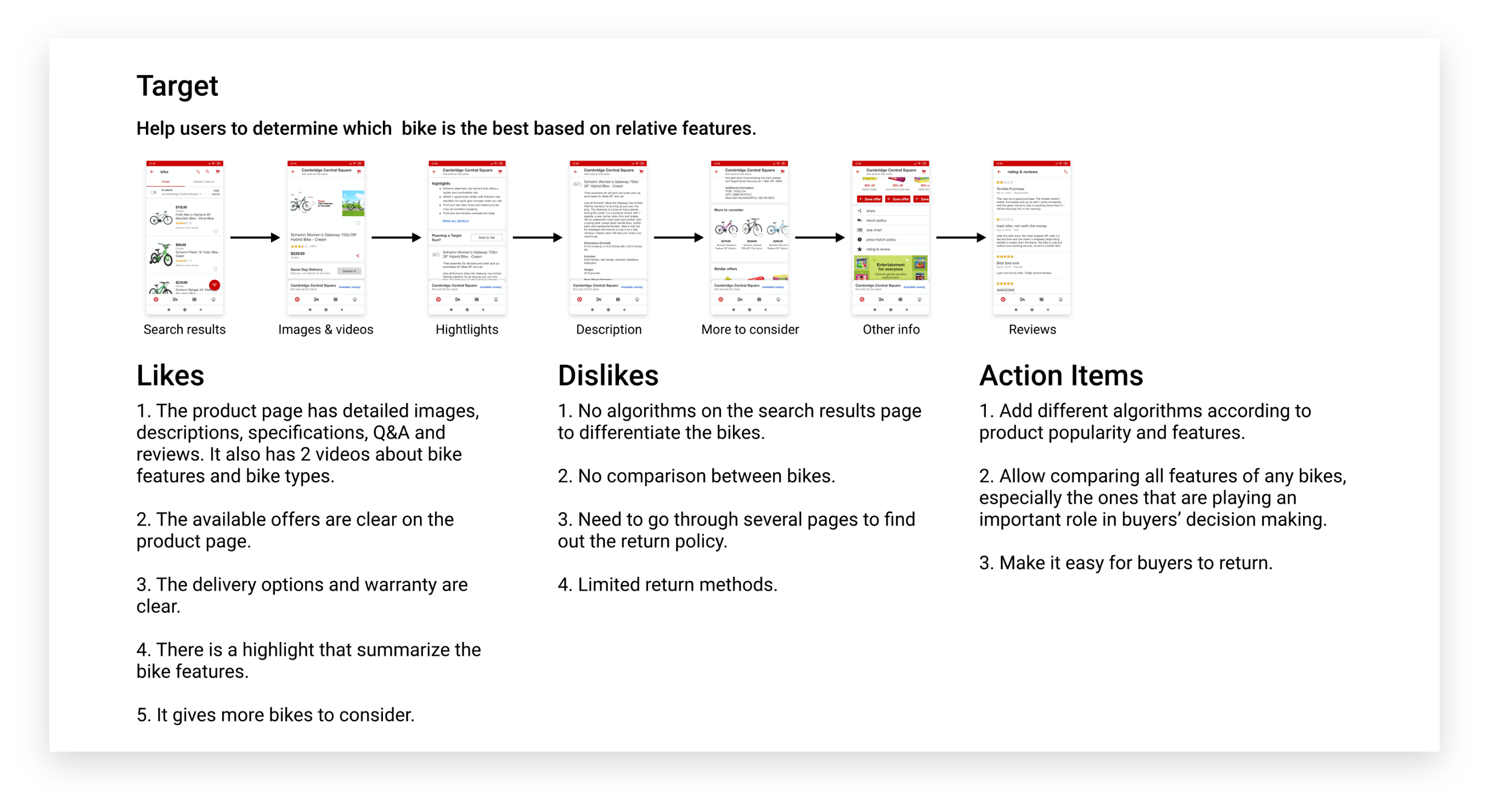
Industrial Leader Research of Target
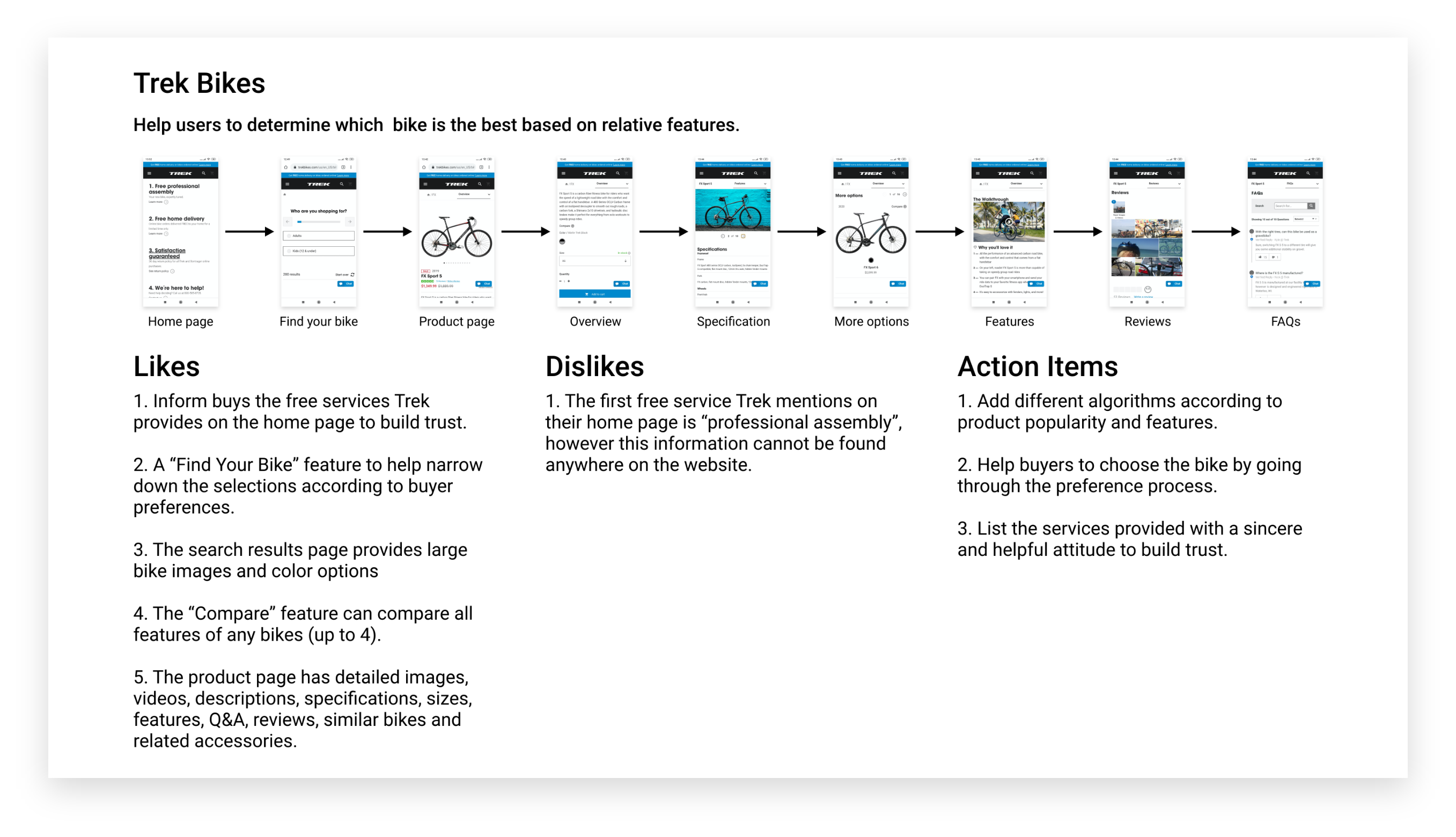
Industrial Leader Research of Trek Bikes
SECONDARY RESEARCH
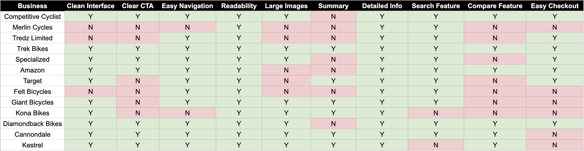
In order to have an in-depth understanding of the industry, I conducted a secondary research on 13 most popular bike stores online.
I started from getting to know the different types of cyclists, bikes and bike components to build a solid foundation for the secondary research. And then I looked at current case studies and website reviews to find answers to my research questions, as well as conducting a competitive analysis of the features of 13 most popular online bike stores in the world.
My research was focusing on:
- How do people currently purchase a bike online? If they don’t purchase bikes online, what’s the reason?
- What challenge do people encounter when purchasing a bike online?
- Despite the usual product details, what other information do people want to see when purchasing a bike?
- Which website or app do people use to purchase a bike, and what do they like and dislike?
AFFINITY MAP
I then used affinity map to summarize the findings from the industrial leader research and the secondary research.
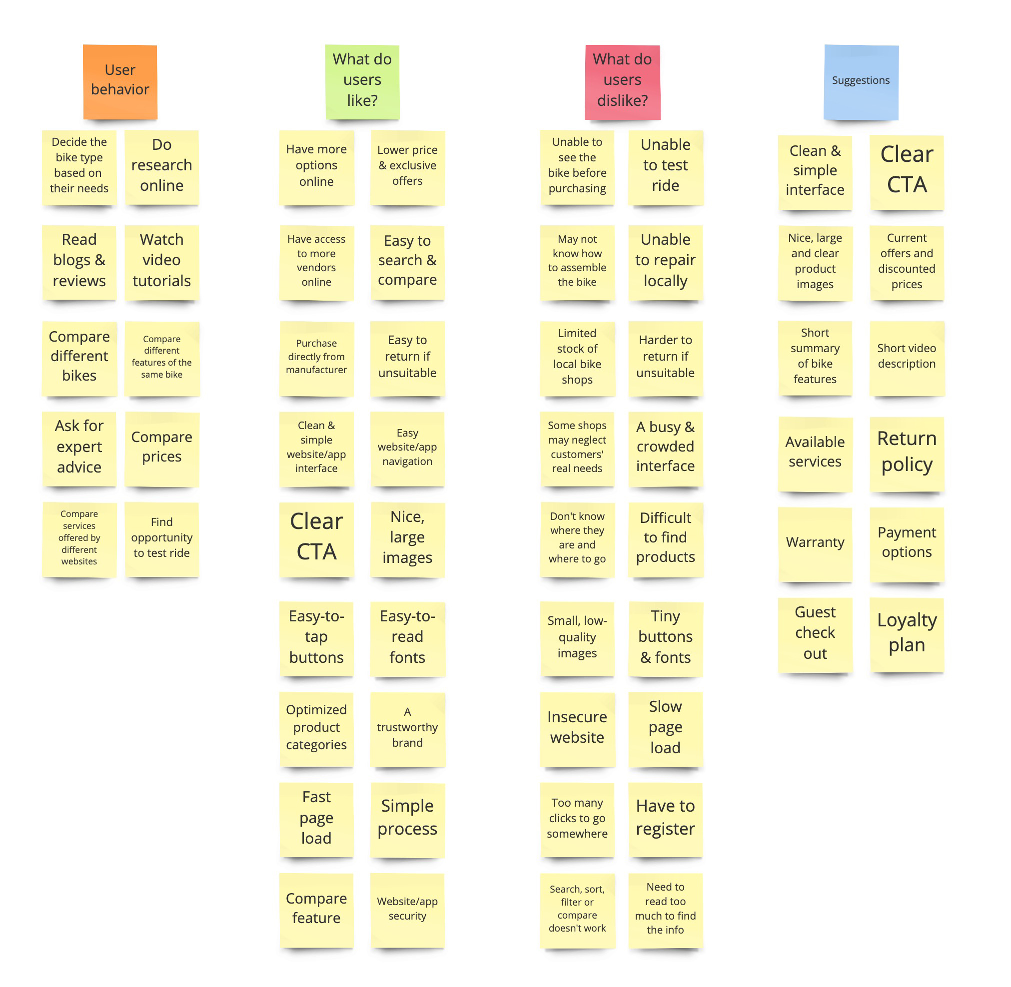
Main takeaways:
- Customers value a clean, clear and easy-to-use website with high-quality images.
- The main reason that customers don’t buy bikes online is because they can’t test ride or return the bike if it’s unsuitable.
- Customers get bored when reading long texts about the bike.
- Customers need help to find the most suitable bike.
- Customers want all processes to be simple and fast.
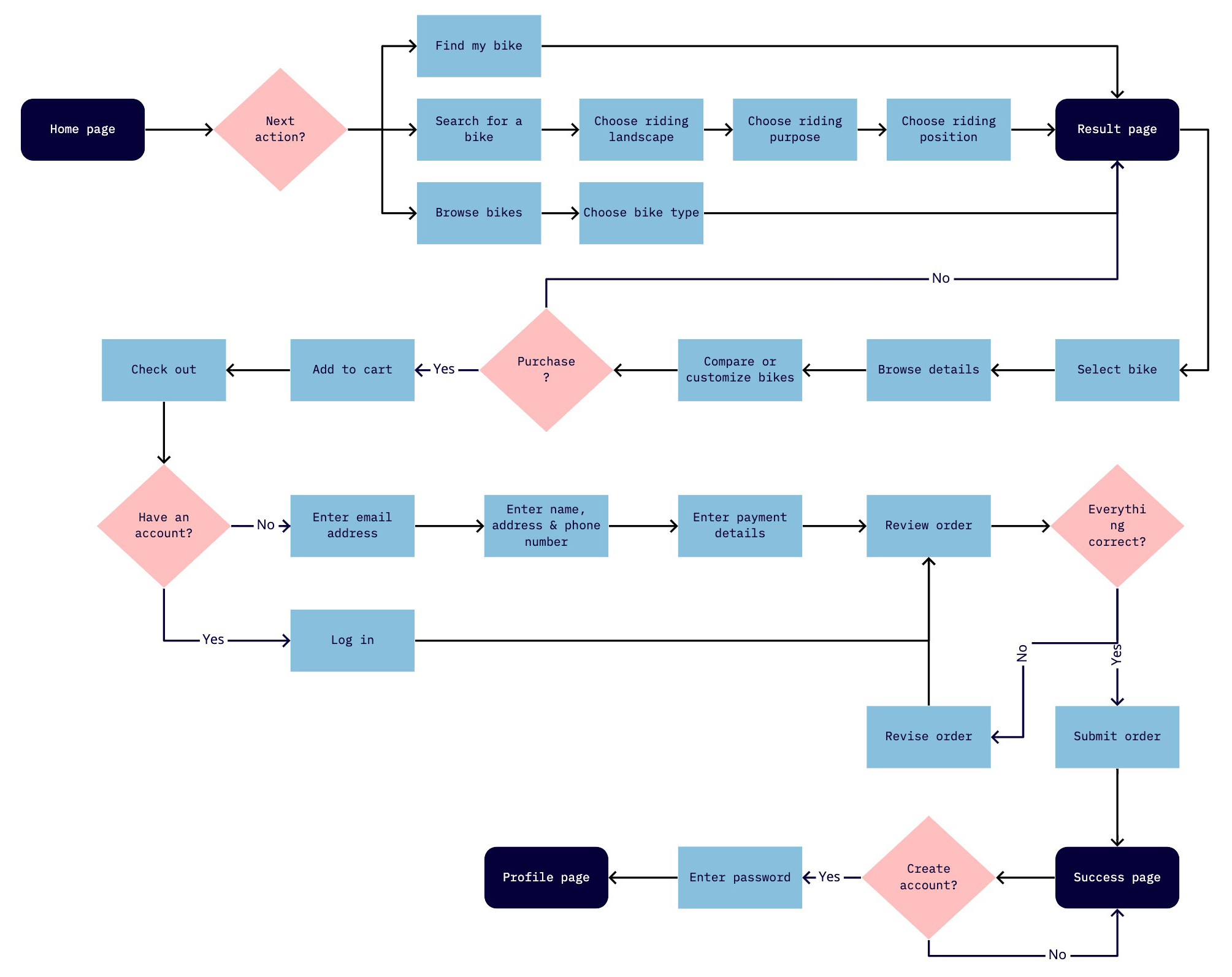
USER FLOW
My main goal was to simplified the purchasing process by helping users to choose the most suitable bike and check out easily.
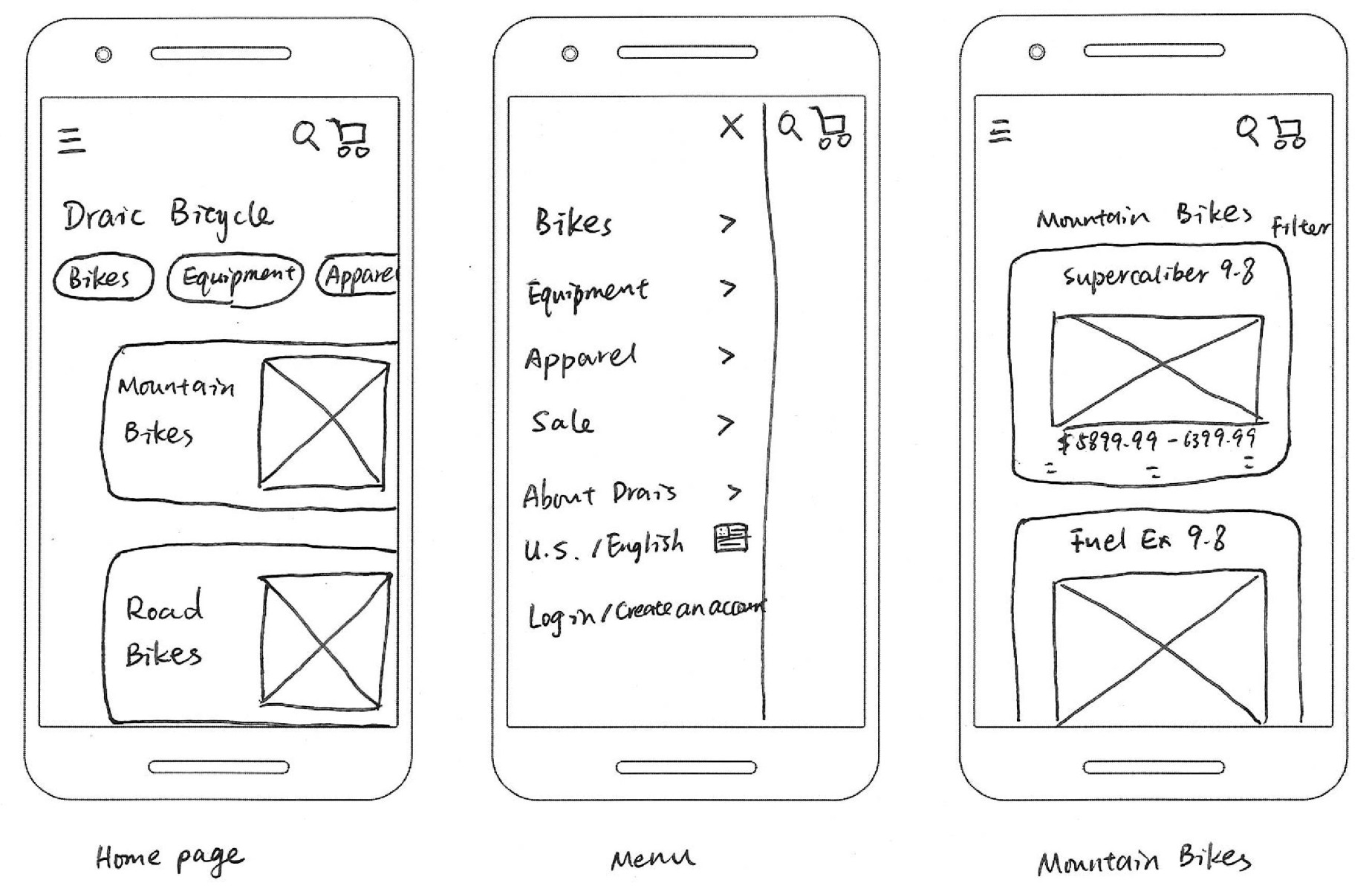
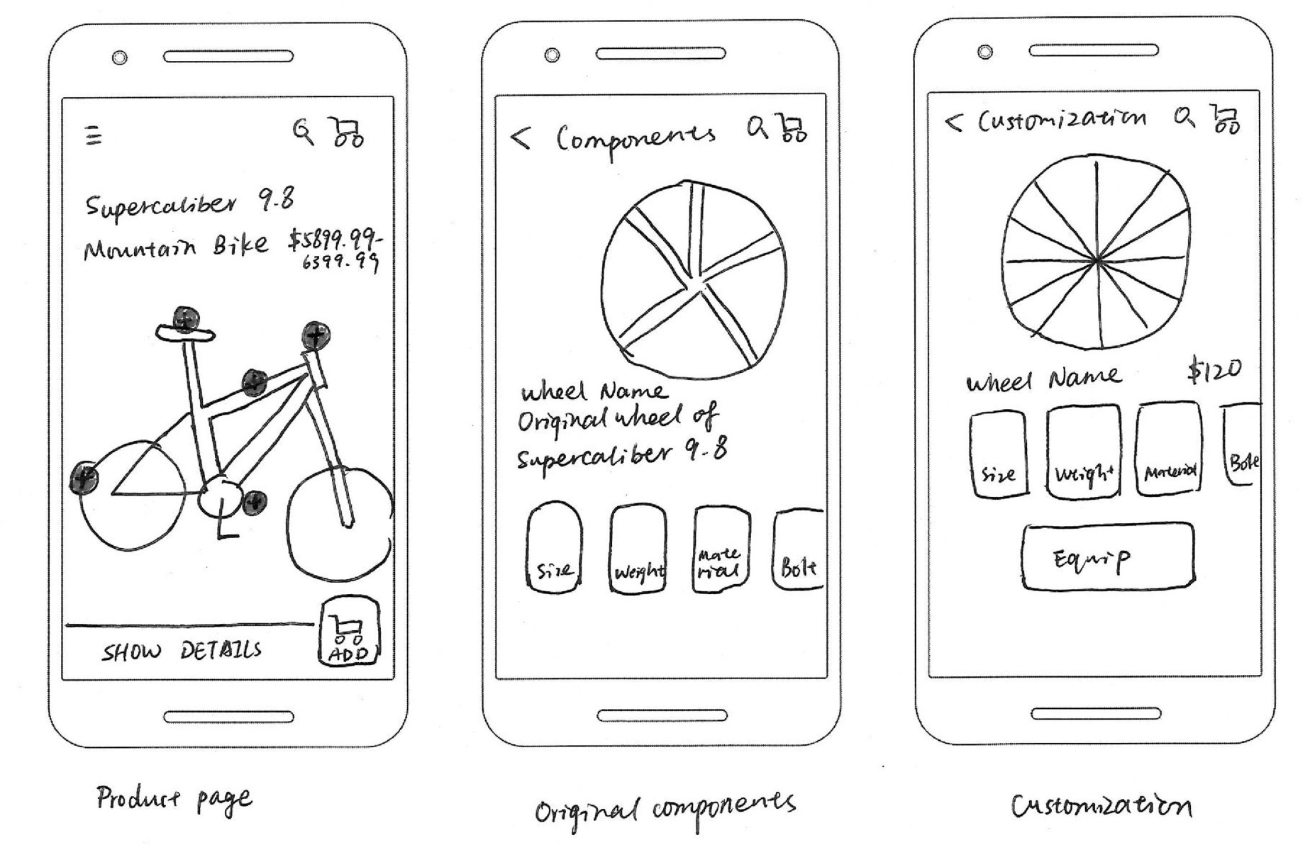
SKETCHING
Based on the research result, I made these sketches on paper for the main screens in the purchasing process.
1ST ROUND USABILITY TESTING
I used the Marvel app to convert the sketches into a clickable prototype, and conducted moderated usability testings with 5 people remotely.
Pain Points | Solution |
1. Users don’t know what bikes are suitable for them if they are not experts. | 1. Add a “Find my bike” process to narrow down the selections according to user needs. |
2. Users can’t find the “Compare” feature. | 2. Make the “Compare” feature available on the product list and on the individual product page. |
3. It’s inconvenient to go back to the previous page. | 3. Change the “Menu” button to “Back” arrow. |
4. Users cannot sort the bikes by ratings. | 4. Add the “Sort” feature. |
5. Users can’t find the “Customize” feature. | 5. Show the customization options on the feature page. |
PROTOTYPING
I created the prototype taking into consideration the findings from the 1st round usability testing.
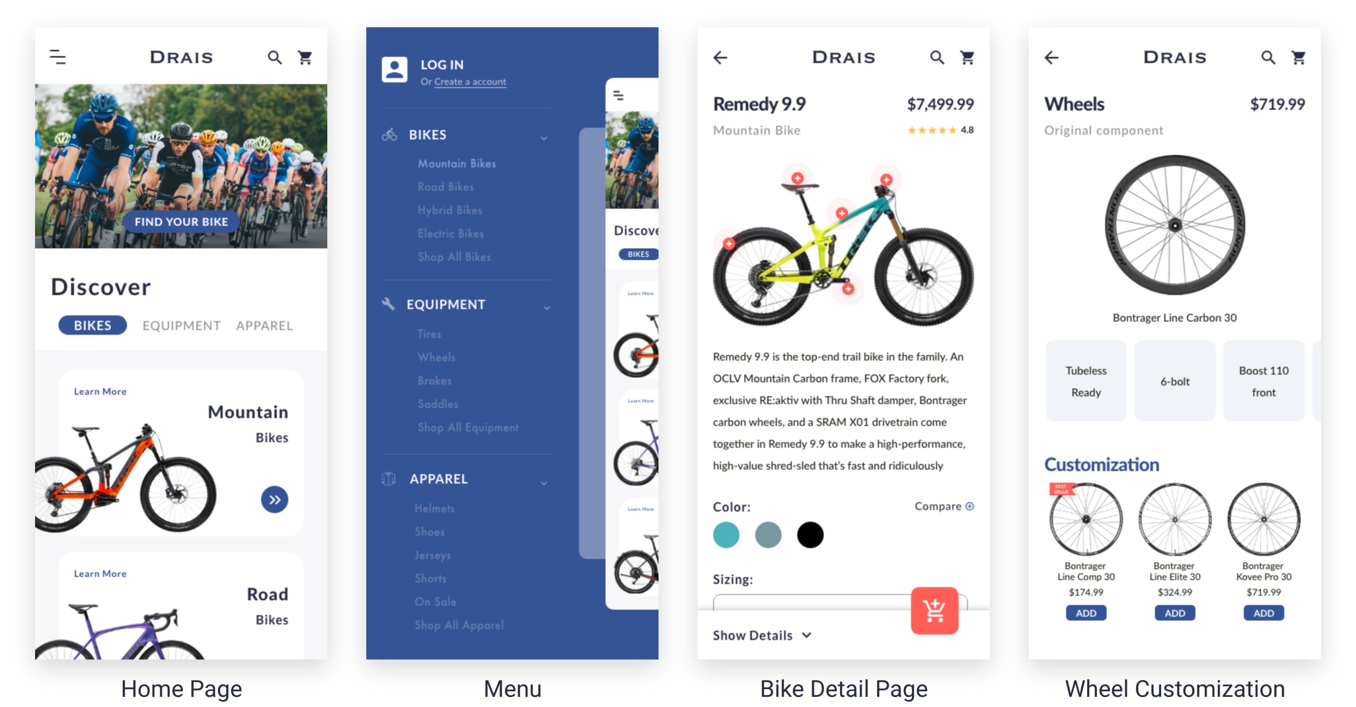
The prototype mapped out 2 main processes - finding a suitable bike and check out.
The “Finding a suitable bike” process:
- New cyclists who don’t know which type of bikes they need can use the “Find my bike” feature to help them to figure it out.
- Users can choose different bike categories and browse the bikes.
- Users who know exactly what they are looking for can use “Search” to find the bike.
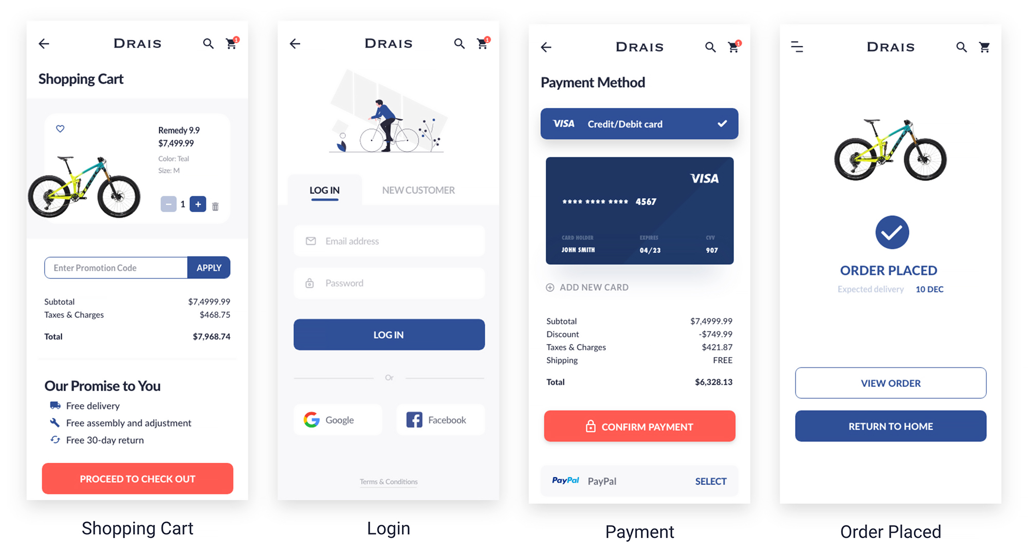
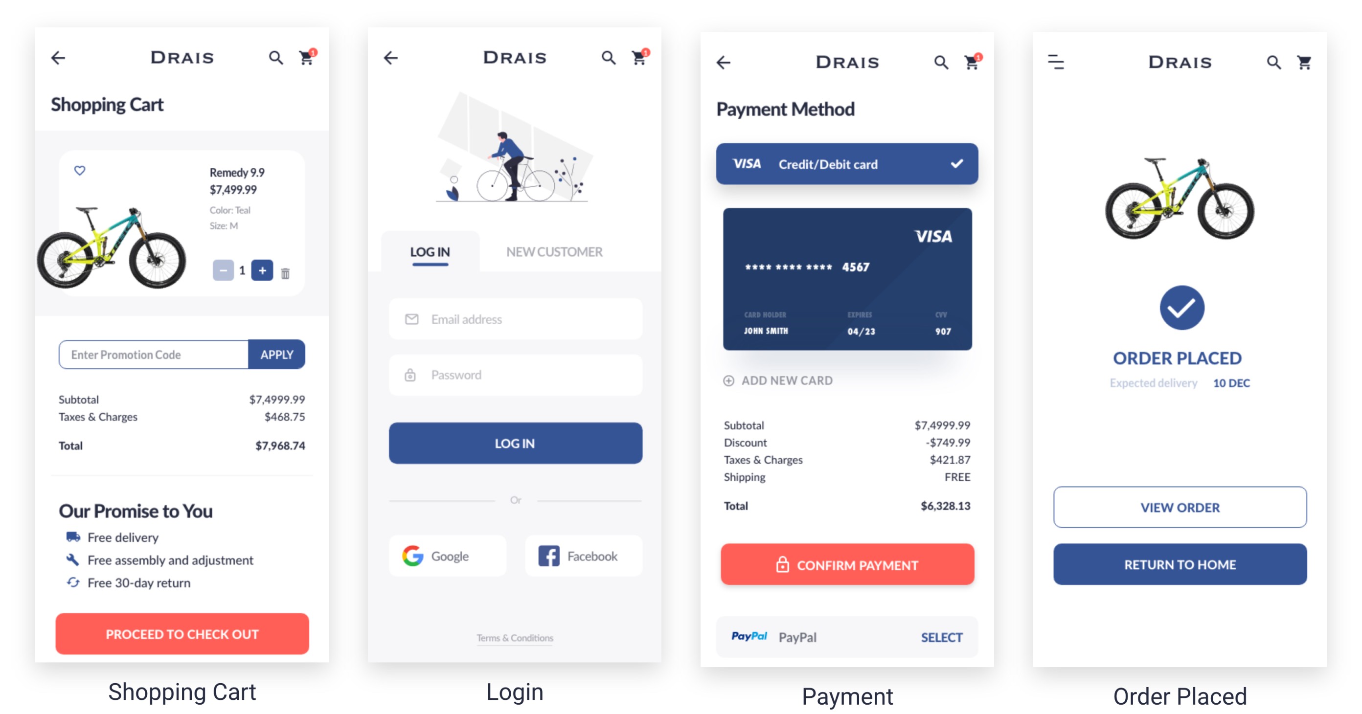
The “Check out” process:
- New customers can check out as a guest and decide if they want to create an account later.
- Return customers can login for a faster check out.
2ND ROUND USABILITY TESTING
To see if my solution work well, I shared the prototype with 5 people and asked them to complete 3 tasks.
I ran the 2nd usability testing to see if my solution worked well. To do that I tested the prototype with 5 people who had never seen it before. I told them to complete 3 tasks, including choosing a bike and checking out, and observed their operation remotely online by asking them to sharing their screen with me.
During the 2nd usability testing I still discovered 11 usability issues, however the issues were quite minor and most of them were “nice-to-haves”. The main ones are listed as below:
Pain Points | Solution |
1. Users don’t know they can use the “Find my bike” feature. | 1. Make the CTA “Find my bike” more visible. |
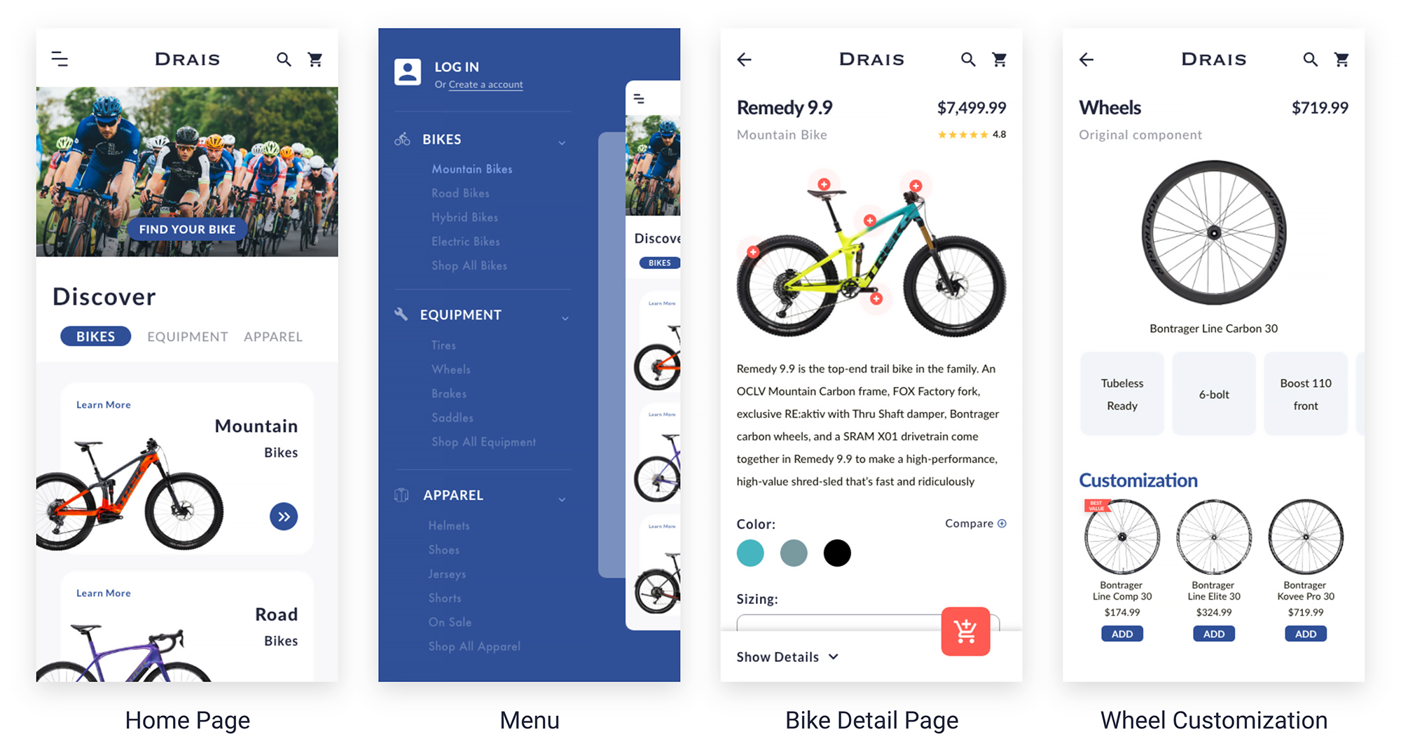
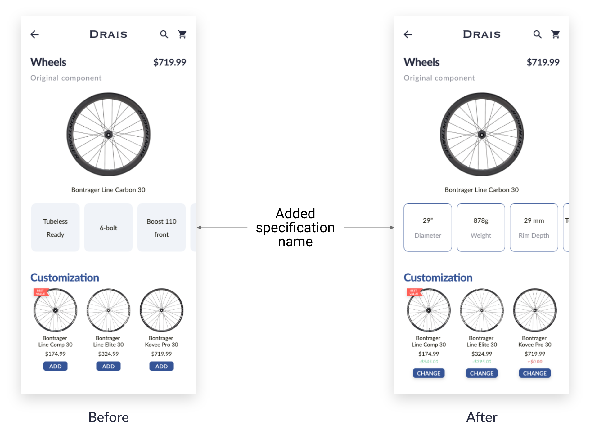
2. Users would like to have the information of wheel size, weight and rim depth. | 2. Add wheel size, weight and rim depth to the wheels detail page. |
3. Users would like to know the assembly options. | 3. Add an info icon next to “Free assembly”. |
4. Users would like to be informed that they’ll receive an email confirmation after they place the order. | 4. Add email confirmation to the “Order placed” page. |
5. The “Add to cart” icon is confusing for users who don’t know the icon. | 5. Add “Add” below the icon. |
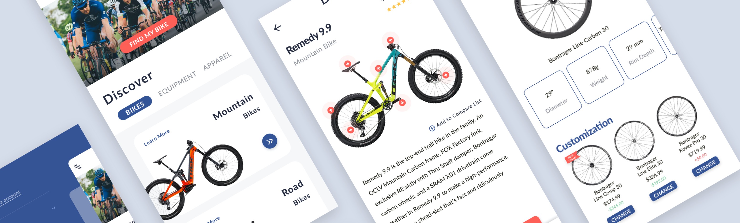
FINAL PRODUCT
I iterated the prototype according to the findings from the 2nd round usability testing, and created the final product.

REFLECTION
Micro-animations is an indispensable part that adds personality and characteristics to the UI.
My UI skills were effectively improved in this project as I worked hard on the micro-animations to make the UI more fun and interactive, as the micro-animations is an indispensable part that adds personality and characteristics to the UI.
I learned to pay attention to the smallest but yet important details. For example, some users may not know what the “add to cart” button is for without the text “ADD”, which could cause a low conversion rate.
I also learned that users like to be informed at every stage of the process, so I iterated the UI to let them know when the item has been added to cart, and that they will receive an email confirmation after the order is placed.
NEXT STEPS
For next steps, I would like to complete the prototype by adding the service details such as assembly options and delivery options, which play a decisive role on whether people will choose to purchase bikes online.